Nice work. I like the block in but just a touch of over detail but I like it. I may be signing up for your course. My wife just past away so need some time.
Beautiful as always Andrew!—Dennis A. USA
Where is the Tree tutorial (not just this autumn scene)? Or is it not ready yet? I have been waiting for several years for it & I can’t find it. I’ve been expecting an email when it came out, but I either didn’t get it or I missed it.
: (
Thank you so much, Pam
Andrew,
Very nice. It’s a beautiful fall painting. Well Done.
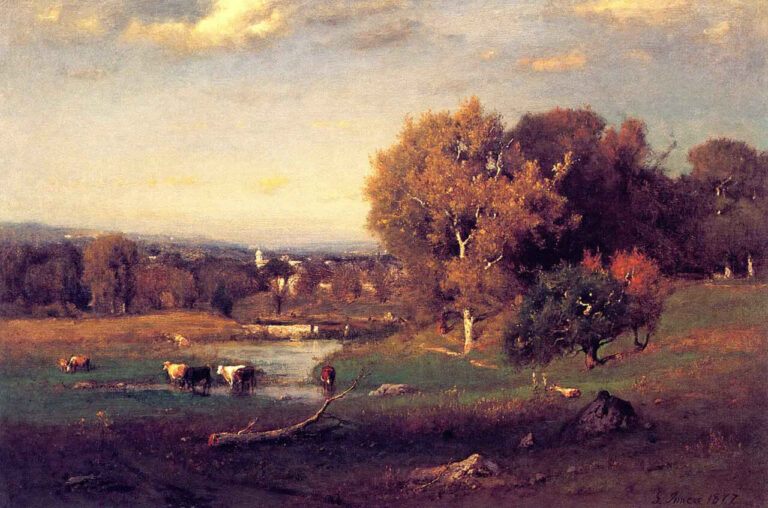
Thanks for the shout out to the ole Hudson River painters. They were my inspiration to go forwards back in the 1970’s. I saw F.E. Churches Heart of the Andes in black and white no less. I said, a man can do that with paint?
Wow, and away I went.
Steve
I really like your New blog.It’s very inspiring and will help me in my paintings.
Thank you and I will wait for next.
The blog was well done and very helpful. However, the drop down called Never Miss a Post, never left the screen. I could not find a way to remove it. Had to read the blog maneuvering around it.
Totally enjoyed this blog , well done Andrew , beautiful work as always .
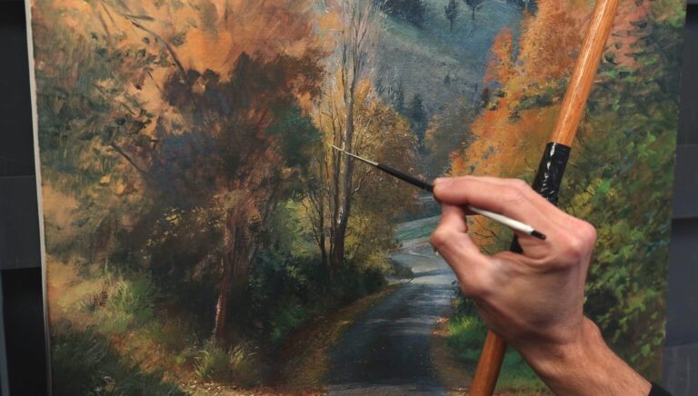
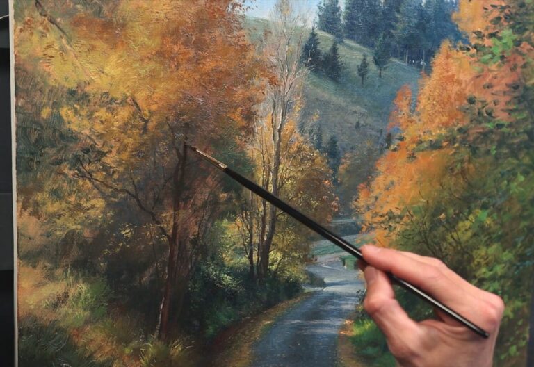
I would paint this ,you’ve made it quite appealing , your photos were actually really good glad you took a chance and used it to show us something real also enjoyed that you also placed some old masters work in the mix, and thoughts made it resonate with your technique , which I love
Great work as usual Andrew. Thank you for your inspirations.
Jan
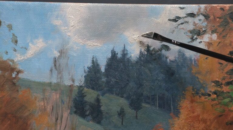
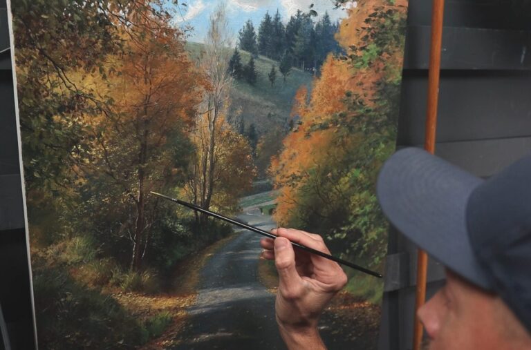
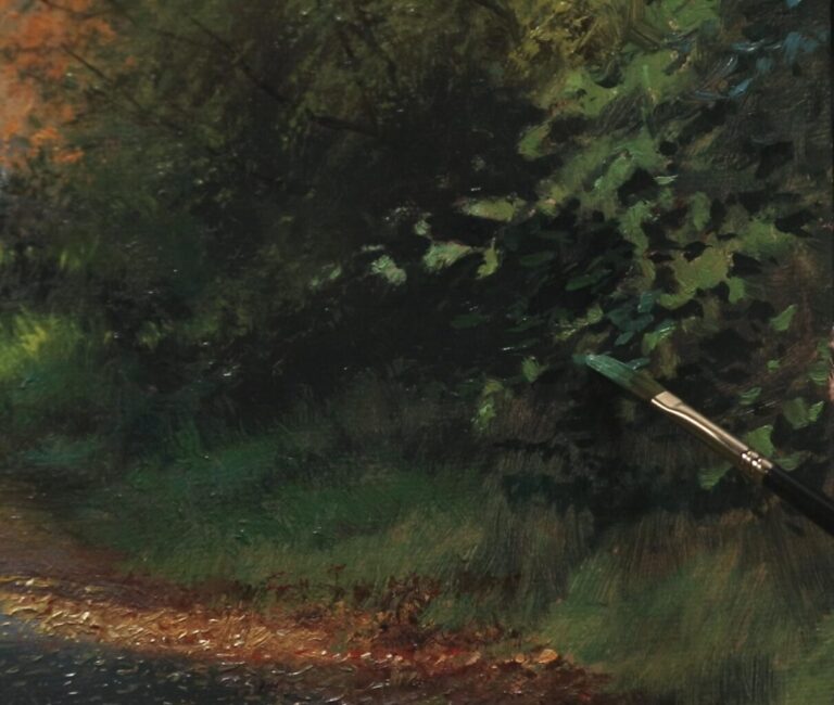
Thank you for explaining your process – such as saving the expanded value range (including darkest darks and lightest lights) for the foreground. That’s a great tip.
9 responses
Nice work. I like the block in but just a touch of over detail but I like it. I may be signing up for your course. My wife just past away so need some time.
Beautiful as always Andrew!—Dennis A. USA
Where is the Tree tutorial (not just this autumn scene)? Or is it not ready yet? I have been waiting for several years for it & I can’t find it. I’ve been expecting an email when it came out, but I either didn’t get it or I missed it.
: (
Thank you so much, Pam
Andrew,
Very nice. It’s a beautiful fall painting. Well Done.
Thanks for the shout out to the ole Hudson River painters. They were my inspiration to go forwards back in the 1970’s. I saw F.E. Churches Heart of the Andes in black and white no less. I said, a man can do that with paint?
Wow, and away I went.
Steve
I really like your New blog.It’s very inspiring and will help me in my paintings.
Thank you and I will wait for next.
The blog was well done and very helpful. However, the drop down called Never Miss a Post, never left the screen. I could not find a way to remove it. Had to read the blog maneuvering around it.
Totally enjoyed this blog , well done Andrew , beautiful work as always .
I would paint this ,you’ve made it quite appealing , your photos were actually really good glad you took a chance and used it to show us something real also enjoyed that you also placed some old masters work in the mix, and thoughts made it resonate with your technique , which I love
Great work as usual Andrew. Thank you for your inspirations.
Jan
Thank you for explaining your process – such as saving the expanded value range (including darkest darks and lightest lights) for the foreground. That’s a great tip.